Continuing on with the previews of the new L'Oreal products we received at the L'Oreal Preview event, here are three of the new Colour Riche Eyeshadow Quads.
For the first time, the world's colour authority bursts into the world of eye colour. Colour Riche Eyeshadow Quads are four expertly harmonized colours in a single irresistible golden case. Each one is made up of micro-milled pigments to create an irreplaceable silk texture on skin. The secret of the smooth, layerable colour? Powder pigments are suspended in a crystal-clear base that ensures the colour stays incredibly rich and smooth - never chalky or powdery. Featuring 20 quads with colours ranging from beautiful beiges and taupes to daring blues and purples to ultra-feminine pinks and greys, this is the secret to unforgettable eye impact.
Suggested retail price: $11.99
Each palette holds four eye shadow colours, all roughly the same size and placed in the order of application as indicated on the back of each package. Each comes with a small dual-end sponge applicator. A sticker on the back indicates the placement of each colour on the eye:
- First colour: All over the eyelid.
- Second colour: Browbone.
- Third colour: Crease.
- Fourth colour: Lashline.
Here is the Cookies & Cream quad, a collection with sparkly charcoal, silver, grey and frosty white.
Note: When I first received the quads, some of the eyeshadow pans, specifically the top two (in the photo above, the two on the left) were wobbly.
A week or so later, I noticed that in the Cookies & Cream quad, those pans had dislodged completely and were rattling around inside the quad. There was no evident damage to the eyeshadows themselves however.
Perhaps these were sample palettes given out for PR purposes and the actual quads you'll be able to buy in stores will be better quality.
Here are the four Cookies & Cream shadows swatched. Pigmentation and texture were inconsistent among the four colours, as you can see below. The white brow and the silver crease colours had the most pigmentation and the creamiest texture. The grey lid shade has less shimmer, as does the dark black/grey lashline colour. It's great to see that not all shades are the same texture, particularly for a drugstore brand, since they tend to offer only very sparkly and very shimmery eyeshadow options.
A word on the texture. As claimed, the texture is creamy and silky and pleasant to work with overall. Because of the softness and silkiness, there is a lot of mess generated when applying it. Starting with a small amount of product will help to prevent this.
Following the instructions on the packaging, here it is on me. Although the instructions don't indicate putting any product beneath the eye, I opted to use the crease colour there.
This silvery smoky eye look would be good for an evening look but this was my least favourite of the three quads. I wish the crease shade had more depth and less shimmer. Layering the black under the crease colour would probably make this look work much better.
Grade: C
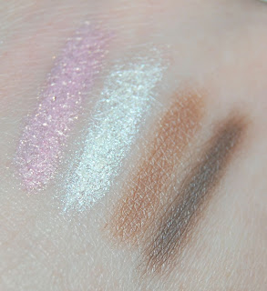
Here is the Good Luck Charm quad, a combination of colours that make me think of Neopolitan ice cream - browns, cream and pink.
Like the previous quad, this too had two shades more creamy and shimmery than the others. In this the pink lid colour and the vanilla browbone highlight colour have a lot of shimmer. The warm caramel shade and the chocolate shade have less.
This look is the most soft and natural of the three quads. While the brow shade is very frosty, the rest of it is very wearable and flattering. This quad is lovely and warm and suited well for all eye shades. I would use a different highlight product though. This one is too white and too shimmery for the rest of the quad. I used the dark brown liner shade under my eyes although it wasn't in the instructions for application.
Grade: A
Finally, here is the Sophisticated Angel quad. I also quite liked this combination of taupe, champagne, purple and grey.
Here's a photo that shows some of the mess created by pulling the applicator through the eyeshadow pan.
Here are the swatches. This quad has three shadows with a similar texture with the dark grey being a little flatter.
Here it is applied. The highlighter shadow in this quad is much less intense than the other two. I really like the purple and taupe shades but as you can see, the dark liner shade was difficult to blend. I prefer a softer eyeliner line.
Grade: A-


No comments:
Post a Comment